ELDERLY FINANCIAL - FINTECH
User Experience Design - Figma Prototype - Usability Test
The Challenge
The challenge was to find ways to encourage senior newcomers to Canada to begin baking and learning from their phones about financial benefits, offers and programs that are available to them.
The Goal
The goal of this platform is to allow newcomers to Canada to connect with a financial institution representative to learn about financial and governmental benefits as well as educate users on how to use their bank mobile application through video tutorials.
My Role
My work was to apply fundamental user experiences practices like wireframing, prototyping, user research and usability testing. In addition to taking charge of the development of visual and user interface design.
User Research
Initial User Interviews
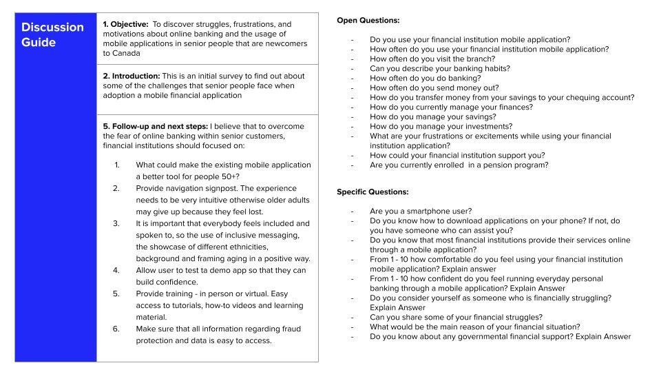
I interviewed 30 participants for this research. The goal of the interview was to discover the struggles, frustrations, and motivations that senior people that are newcomers to Canada have about online banking and the usage of mobile applications.
User Interview Discussion Guide


Interviews Insights
I have found that the key barrier to not using/downloading their financial institution mobile application is fear.
Some of the participants have mentioned that they are active users of smartphones however when it comes to banking they think that current bank mobile applications are not developed nor designed for people their age; some of the comments that were made are; “the mobile applications are not intuitive enough”; “I don’t believe it was designed for someone my age, I am sure the app was designed for a younger crowd”.
Lots of the participants seemed to have internalized stigma and identified themselves as bad at technology. A participant said that They have gotten a smartphone to send pictures, share videos and find directions with Google Maps.
Additionally, some participants feel fear of what might happen if they send money or deposit a check in their bank’s mobile application as opposed to handling the transaction with a teller. Another insight is that all of those who identified as immigrants, members of marginalized communities or religious minorities often feel apprehensive when they are asked to provide personal and financial information. This group mentioned that they would explore their bank’s mobile application if it was in their native language.
“How Might We” Statements
In order to reframe the insights into opportunities for a better user experience. I used HMW statements to translate pain points into actionable design solutions.

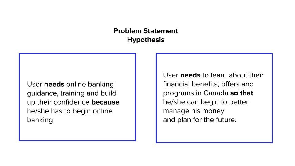
The Hypothesis
Now that I have actionable design solutions, I created a hypothesis based on the insights from the user interviews to design a better user experience for newcomers to Canada.

MosCow Method

2 X 2 MATRIX - Feature Prioritization

User Story and Scenery
Julian is a newcomer to Canada. His level of English is low and he is struggling with his banking transactions.
Julian knows that he could use the bank’s mobile application to perform easy banking like deposits and transfers, but he is having a hard time understanding the language and the same happens with the teller at the branch so Julian desires to learn more about how to use his bank’s mobile application so that he can do more everyday banking with his phone as well as keep track of his finances.
Julian would also like to learn about the benefits and programs that he can receive as a newcomer as well as get in contact with a representative from a bank that can assist him in Spanish.

The Design
The user interface design needs to be easy to scan and easy to understand by seniors - In this case, less is more! The flow must be seamless in order to avoid confusion with clear labels for navigation bars and call-to-action buttons. Additionally, it must be capable to handle multiple languages. Some sections of the application will carry a lot of valuable information so it is important to select a typography that is legible.


The Design Moderated and Unmoderated Usability Test
The purpose of the initial test was to find out if the application was intuitive enough for users. It was important to understand if baby boomers know concepts like user profile and sign-up as well as how to perform easy tasks such as logging in to their profile, switching languages and more importantly the legibility of text.
After that, the focus was on observing if the user can perform specific tasks such as filling out an initial questionnaire, booking an appointment, and navigating bank options.
The application used to conduct usability tests was Maze.

Are you curious about the usability test?
Take Aways


Next Steps to further improve the design and user experience
In order to make the categories and options easier to scan, I will incorporate into the design the use of imagery or icons.
Conduct A/B Testing to identify which solution helps users to scan and understand the information clearly.

