

The Energy Grid Dashboard: AI-Powered Solution to Reduce Wastage in Ontario’s Power Grid
User Experience Design - Product Strategy - Data Analysis
The Project Overview
The Energy Grid Dashboard is a concept project aimed at reimagining how Ontario’s power grid can operate more intelligently. By integrating artificial intelligence and real-time data, the solution reduces electricity wastage, improves resilience, and simplifies complex workflows for grid operators. This project combines data analysis, UX design, and product strategy to create a unified dashboard that replaces fragmented processes with a proactive, AI-driven system.
The Problem Statement
Ontario’s electricity grid faces inefficiencies caused by manual operations, siloed tools, and delayed responses during peak demand. These limitations increase energy loss and place additional stress on operators.
The goal was to design a digital solution that minimizes grid inefficiencies by providing operators with real time recommendations, predictive alerts, and streamlined workflows.
My Role
I acted as both product designer and strategist, translating technical data challenges into actionable product features. My work included:
Mapping operator pain points and workflow inefficiencies
Designing wireframes and interaction flows
Envisioning AI features for predictive insights and automation
Framing insights into recommendations for energy companies
Approach and Tools
Scenario Mapping to identify operator challenges and high impact problem areas
Wireframing and Interaction Design to simplify workflows and reduce complexity
Data Analysis and Conceptual AI Modeling to envision predictive use cases
Tools Used: Python, SQL and Figma
The Process
Understanding the Challenge
Ontario’s energy operators rely on reactive systems, meaning inefficiencies are detected only after they cause disruptions. Manual overload, fragmented tools, and human error contribute to wasted electricity and slower responses.


The Process
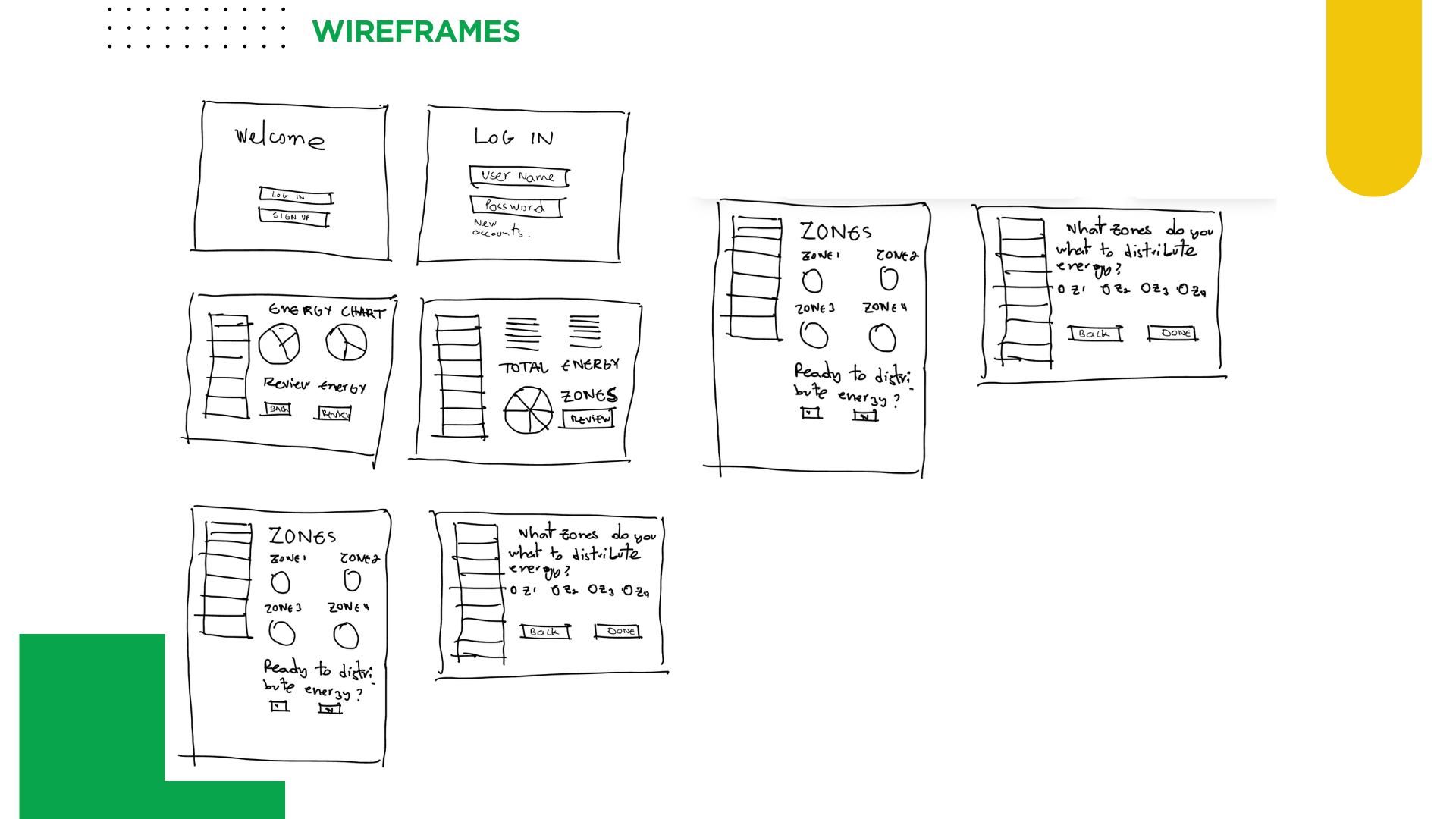
Designing the Experience: Wireframing
The Energy Grid Dashboard was designed as a centralized control hub featuring:
Zone-level recommendations for distribution
AI-generated predictive alerts to prevent wastage
Interactive distribution confirmation flows
Visualized energy trends for each zone

The Process
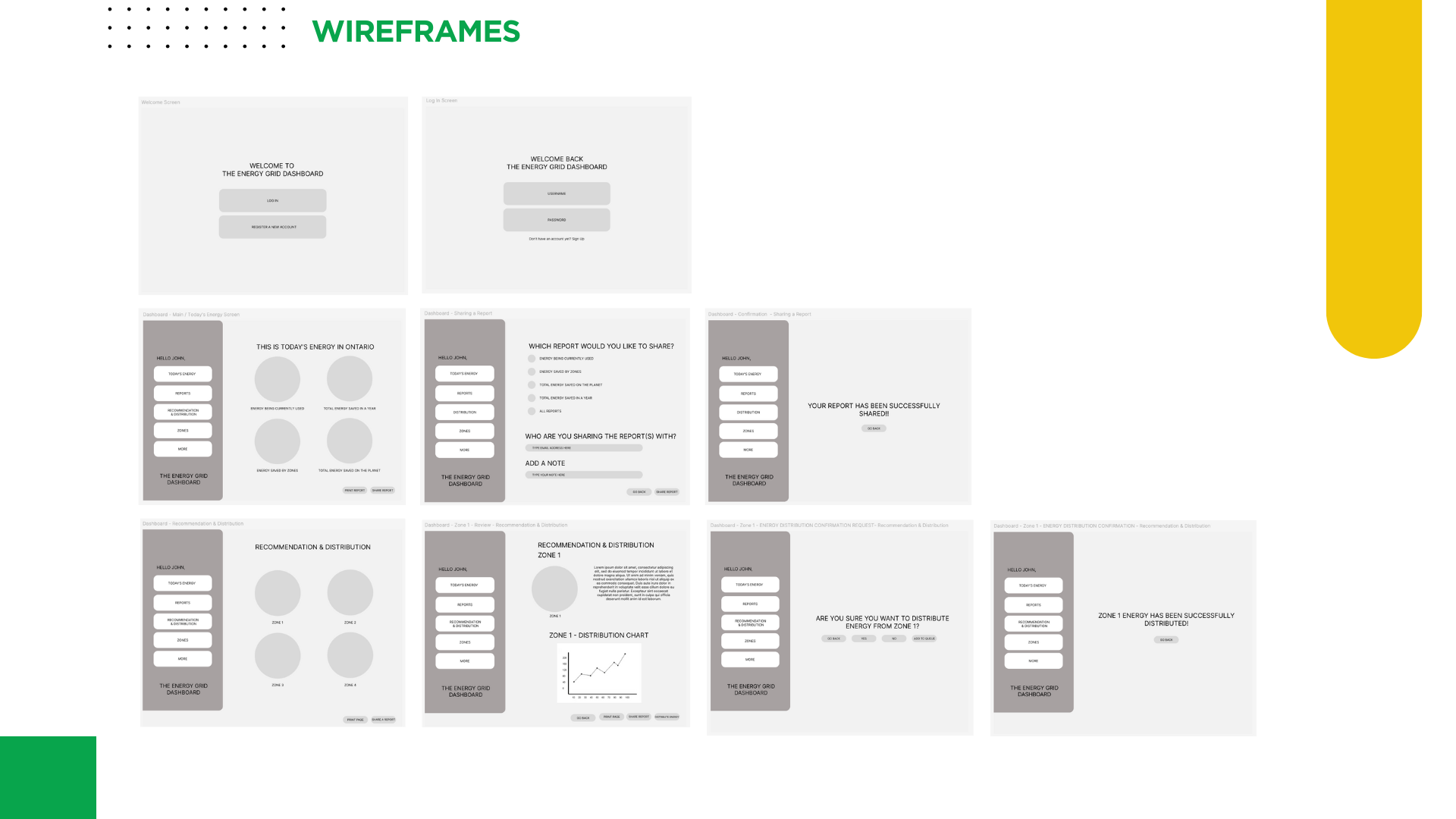
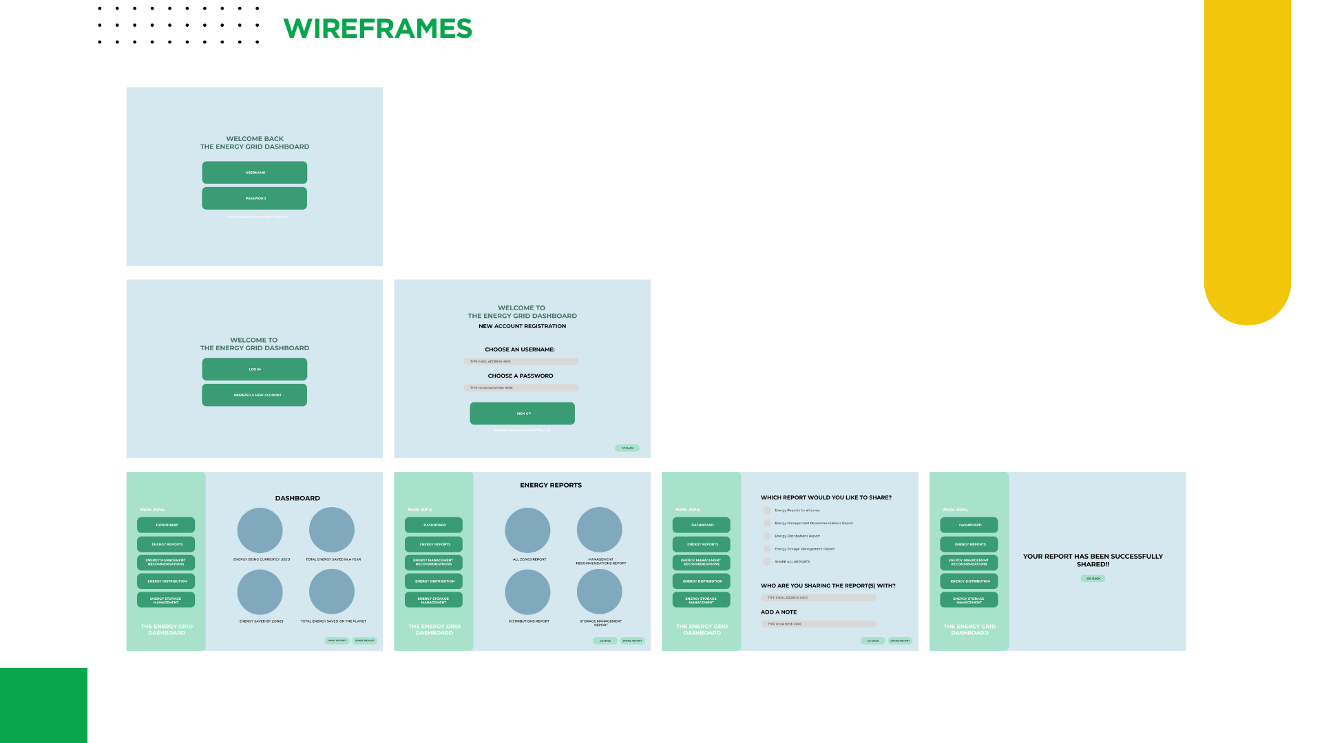
Designing the Experience: Prototyping
To validate the design concept, I created an interactive prototype simulating the main features for operator workflow. The goal was to visualize how operators could interact with AI driven recommendations and distribution confirmation flows.
The prototype highlights:
Energy Recommendations Screen: Displays AI generated distribution insights for each zone.
Zone Distribution panels: Users can explore detailed distribution charts and energy flow data for individual zones.
Distribution Confirmation: Operators receive instant feedback when energy is successfully distributed, or when it has been added to the queue.
Seamless Navigation: A consistent left-hand menu ensures quick access to dashboards, energy reports, and management tools.
This prototype allowed me to demonstrate how complex grid operations can be translated into a clear, human centered interface. It also served as a communication tool for explaining how predictive AI could enhance decision making while keeping operators in control.
Do you want to take a look at the Figma Prototype
Key Insights & Takeaways
AI as a support system: Operators remain in control while AI provides predictive assistance.
Proactive vs Reactive: Predictive modeling enables problems to be anticipated before they escalate.
Trust through simplicity: A clear interface reduces operator stress and increases adoption potential.
Scalability: The dashboard can evolve to support new features like real-time streaming or regional segmentation.